Games are essentially the undertaking of conquering optional obstacles to accomplish an objective where all parties agree on the same set of rules. In order to accomplish this goal, the gamer needs to have enough information to know how to overcome the obstacles. This is usually accomplished through tutorials and the user interface. Information is necessary, but there is a point where the amount of information becomes too much. The more information on screen at one time, the less comprehensible the information becomes and eventually it’ll give the player sensory overload.
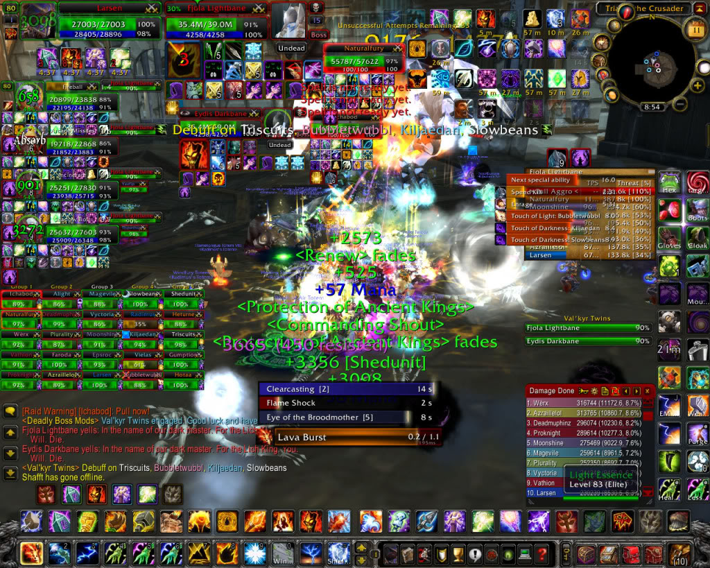
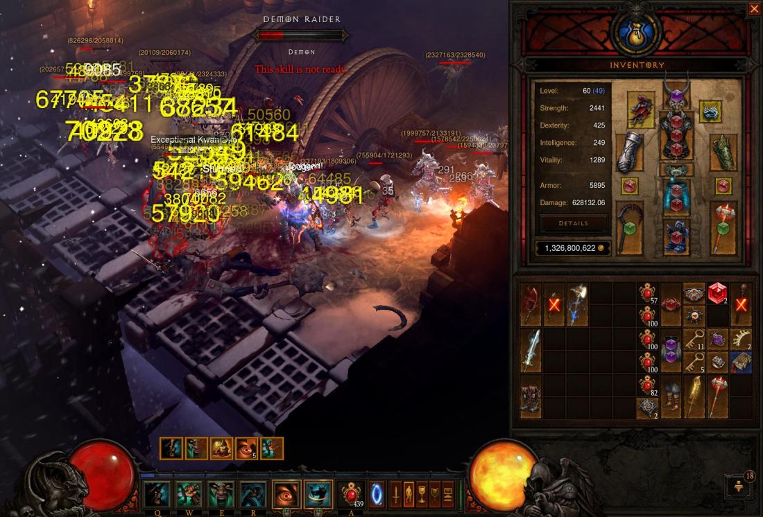
I have only played a few hours of the Diablo series over the years. I’ve always found grinding, exploring identical environments and sorting through piles and piles of loot to be tedious. I have a few friends who love the game and I have seen much more gameplay online. There gets to be a point in Diablo where you get to a high enough level that in order to create a challenge, the game fills the screen with dozens and dozens of enemies. I have found myself watching the gameplay and recoiling in horror at how the screen fills with damage numbers, particle effects, and so many enemies that they can barely move around for the collisions. The HUD also takes up half the screen, by itself, so I have no idea how anyone can understand what is happening in the game. It becomes completely incomprehensible. World of Warcraft can fall into this as well, especially with party raids.
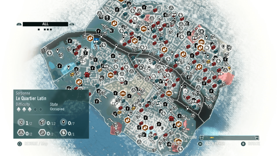
Ubisoft games are infamous for a lot of things, and UI clutter is one of them. Particularly in how they indicate locations in the world. Not only do icons constantly pop up on the screen, compass and minimap, but when you open the map in Assassins Creed or Far Cry, you are usually met with dozens and dozens of map icons flooding the map. It can be overwhelming and even hard to read the important information on the map. In an open world game, the player needs to know how to get around and where to go. If the UI is so overwhelming that it makes the basic information hard to decipher, then there’s a problem. The Witcher 3 and Horizon Zero Dawn, games that I adore, are also pretty bad about this, though not to the same level.
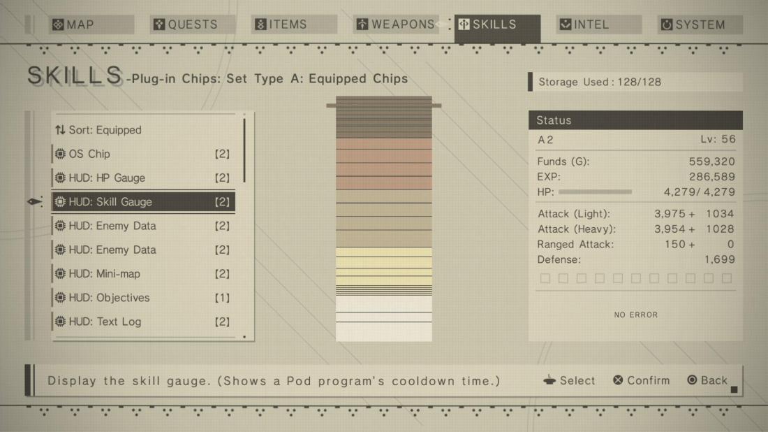
I mentioned that Horizon Zero Dawn overpopulates the map, but the game does have a feature that I never knew I always wanted. There is an option in the menu to turn on Dynamic UI. When you are not in combat or using items, the HUD fades away and simply leaves the entire screen to the bare essentials and the amazing visuals of the game. I love that I can ride across the red rocks of Southern Utah on a robotic bull and watch enormous robotic creatures silhouetted against the sunset without a health bar and equipment obscuring the scenery. It’s a small detail, but I want every game to have this option from now on. I also want to talk some sugar about Nier Automata for a bit. That game does something I have never seen before. Since you play as androids, your UI is treated as software on your hard drive. You can uninstall sections of HUD to make room for other upgrades. You can remove your minimap or your health bar to make room for a damage boost. It was really cool to see the presence of information have a gameplay consequence.
There is a game called Banished. Not very many people know about that game, but I quite like it. It’s a sort of city builder game set in the middle ages. It’s cathartic until disaster strikes. Anyway, Banished is interesting in this discussion because, similarly to Nier Automata, you can add or remove information from the screen. There are tons of menus full of important information: map, job list, resource panel, message log, etc. You can resize and move these information panels around or even remove them entirely. This is a great feature. At the same time, all of the information on the screen is never really explained. The only way to truly know how to play the game is to try and fail until you learn the mechanics or reading a guide elsewhere. So this game has a great UI system, but does a poor job of explaining it.

Information is important, but too much information makes it difficult to parse important information from the rest. The UI should never distract from the gameplay. It should only inform the gameplay, not replace it. I love the idea of being able to customize how much HUD you want, but if the system is complicated, the game should be responsible for teaching the player how to use and understand it. It’s a delicate balance, but an important one.

I’ve never really seen a Blizzard UI before this post. I’m not sure I want to see another one.
And in regards to HZD, I never minded the UI. It didn’t feel that intrusive to me, or maybe I just got used to it.
I think From Software do a real good job with their UI’s. Super Giant game again do some good stuff. Your right, it is a tough but important balance to strike.
Cool post. Thank you for writing it.
LikeLiked by 1 person
Yeah, those are exaggerated examples, but their RPG UIs are overwhelming. I do want to give them credit for their other games though. Overwatch, Warcraft 3, and the Starcraft games all have great UIs.
I also didn’t mind HZD all that much either, but I think that open world games should really try to limit the numbers of icons. It makes it more difficult to parse important information from non-essential information.
From Software and Super Giant are both amazing at it, I agree. I especially loved Transistor’s.
I’m glad you liked it! Thanks for visiting!
LikeLike